Hubbards
OnFire Design invited me to collaborate with them on evolving the iconic Hubbard’s brand. The first brand to create muesli in New Zealand, Hubbard’s was a icon in the breakfast isle. But, as always, new brands were arriving, competing in droves and families’ tastes were changing and evolving.
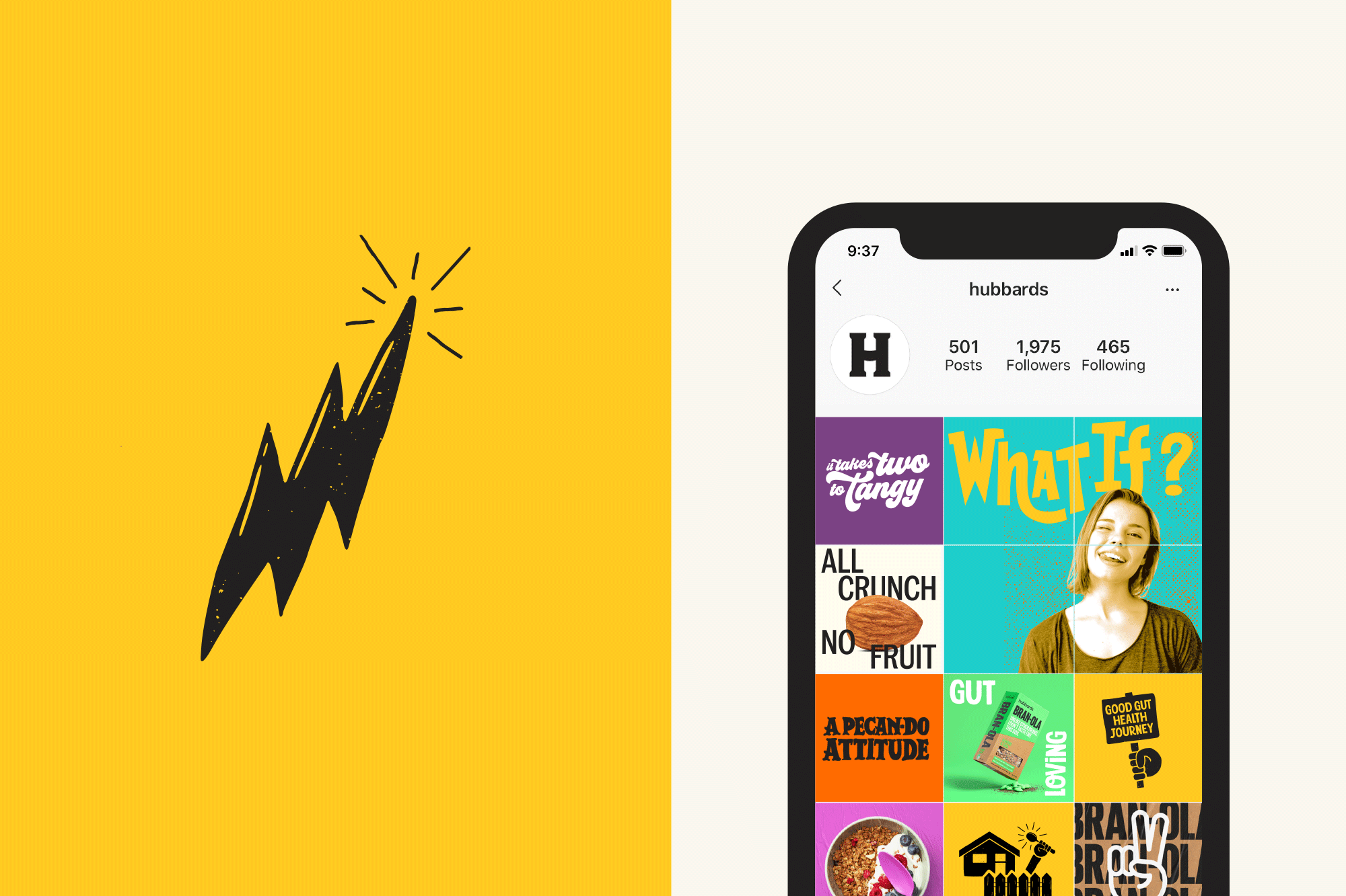
Focusing on brand architecture and developing consumer archetypes initially, I then partnered with the design team on some visual developments, motivated by Hubbard’s new brand purpose: to ‘Imagine what’s possible’.
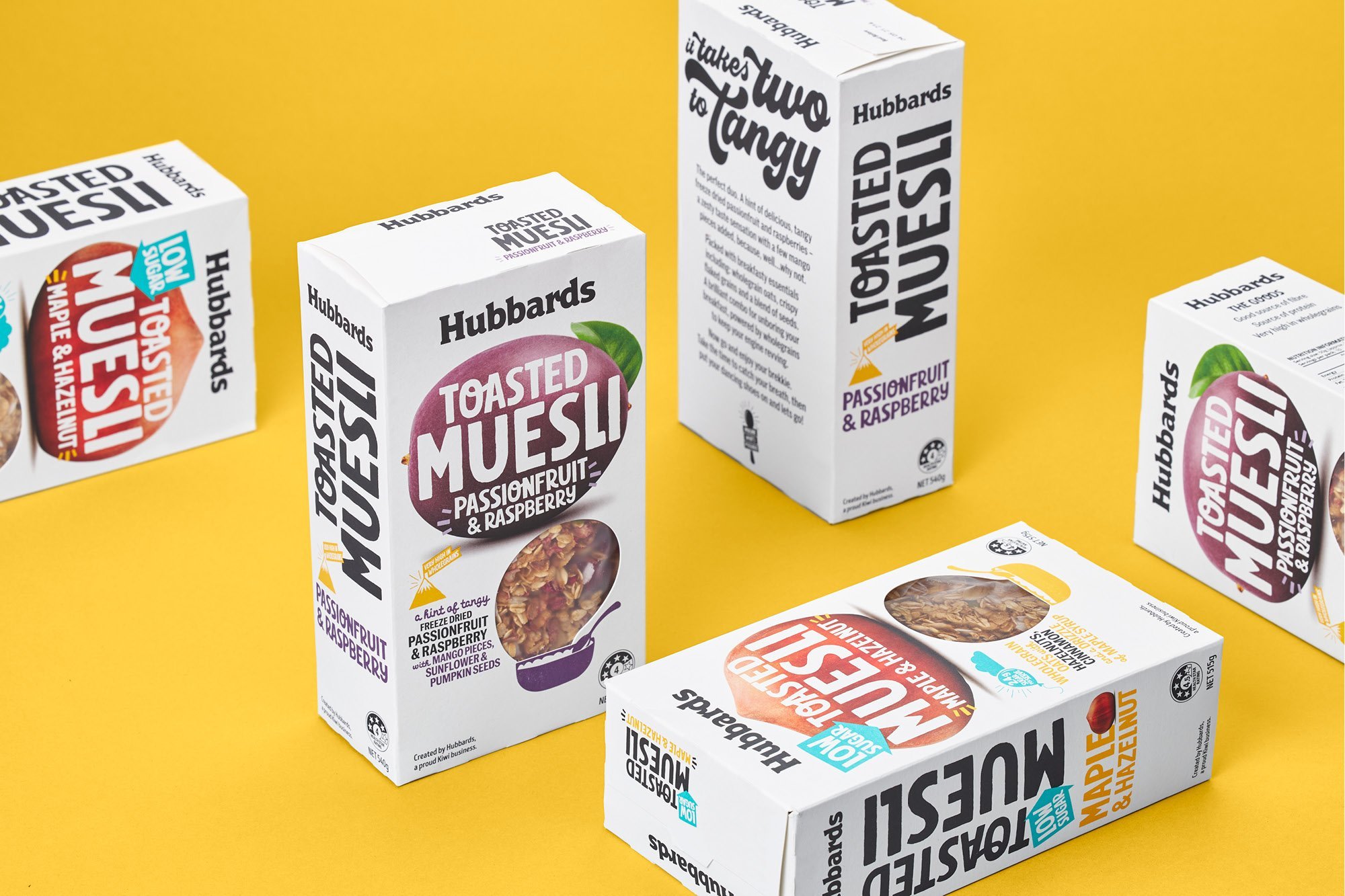
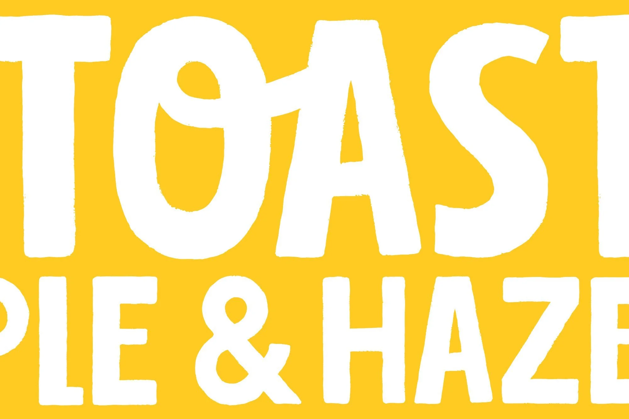
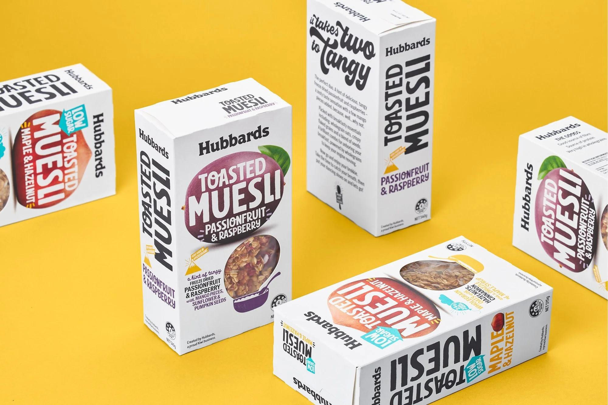
A refreshed brand logo refines the existing typography, black is used instead of brown for ease of use across multiple sub-category ranges. A new brand toolkit was developed which includes a brighter colour palette, product and brand message icons along with its very own bespoke font - Inventive Sans.
© All images copyright of Onfire Design.
Design: OnFire Design
Client: Hubbards
Brand Architecture
Consumer Profiles