Poppi
I worked with Special Design and client The Warehouse Group to rebrand their in-house health and beauty range, Colour & Co. The result is Poppi - a fresh, accessible brand spanning a wide array of affordable essentials and trend-driven must-haves, with a strong focus on the youth and teen market.
We began with naming. After developing an exhaustive list, Poppi stood out as the perfect fit: friendly and approachable, short and snappy, full of personality. From there, Poppi became our muse - the vibrant, supportive best friend everyone wants in their corner.
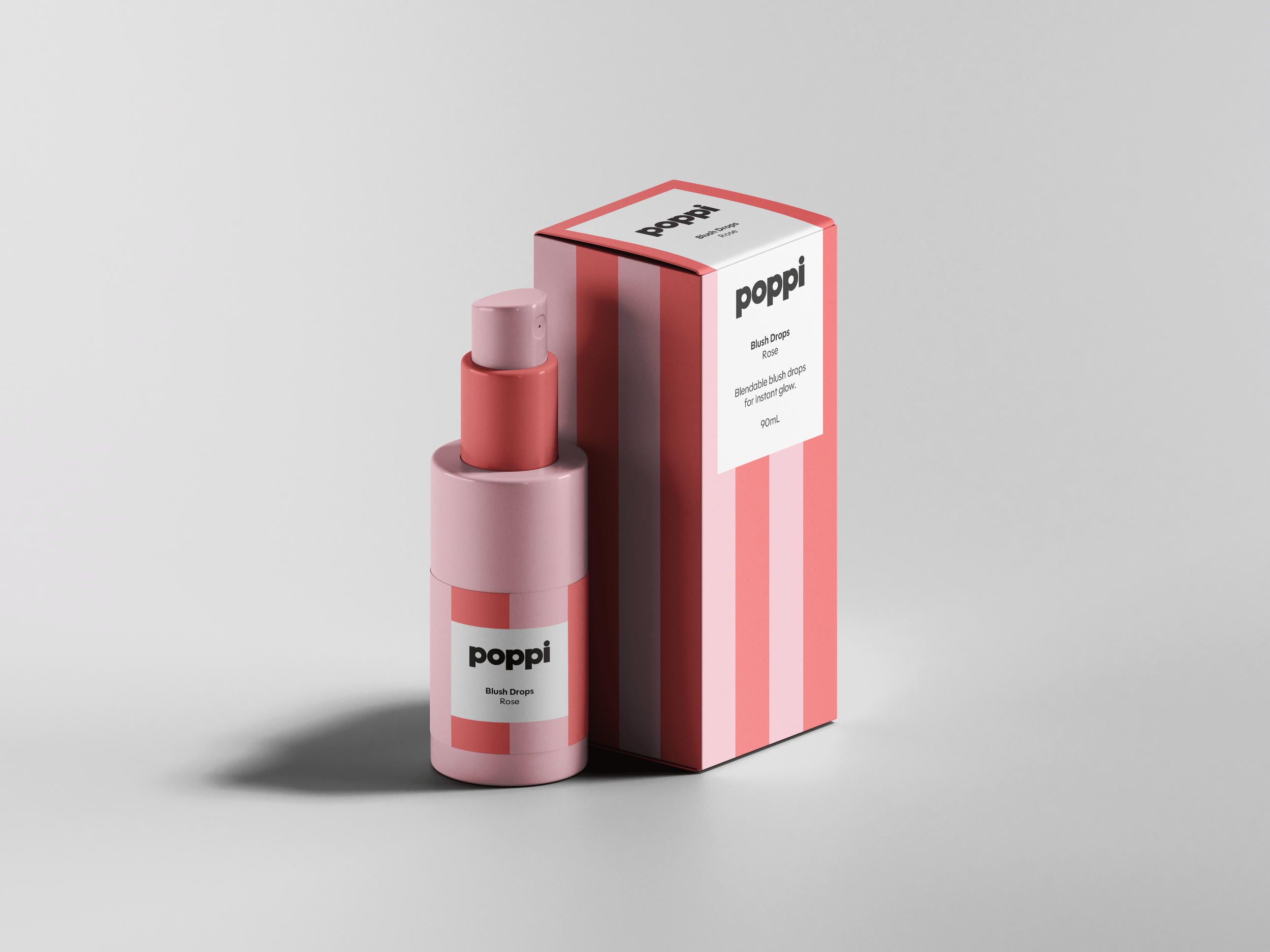
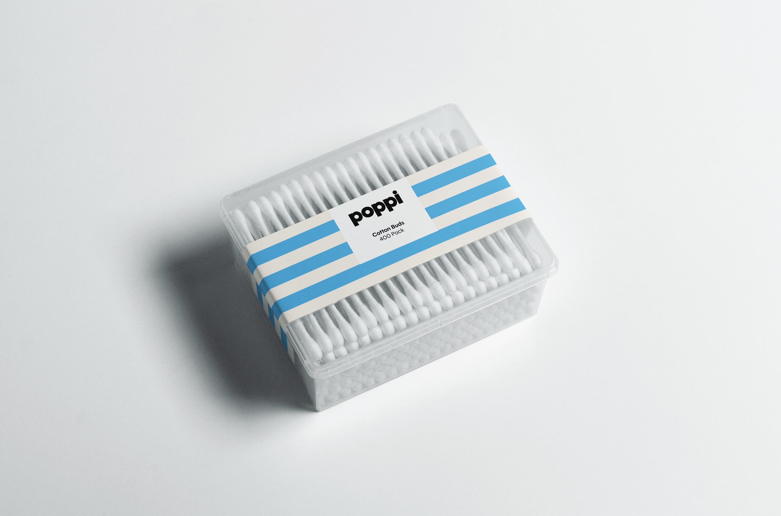
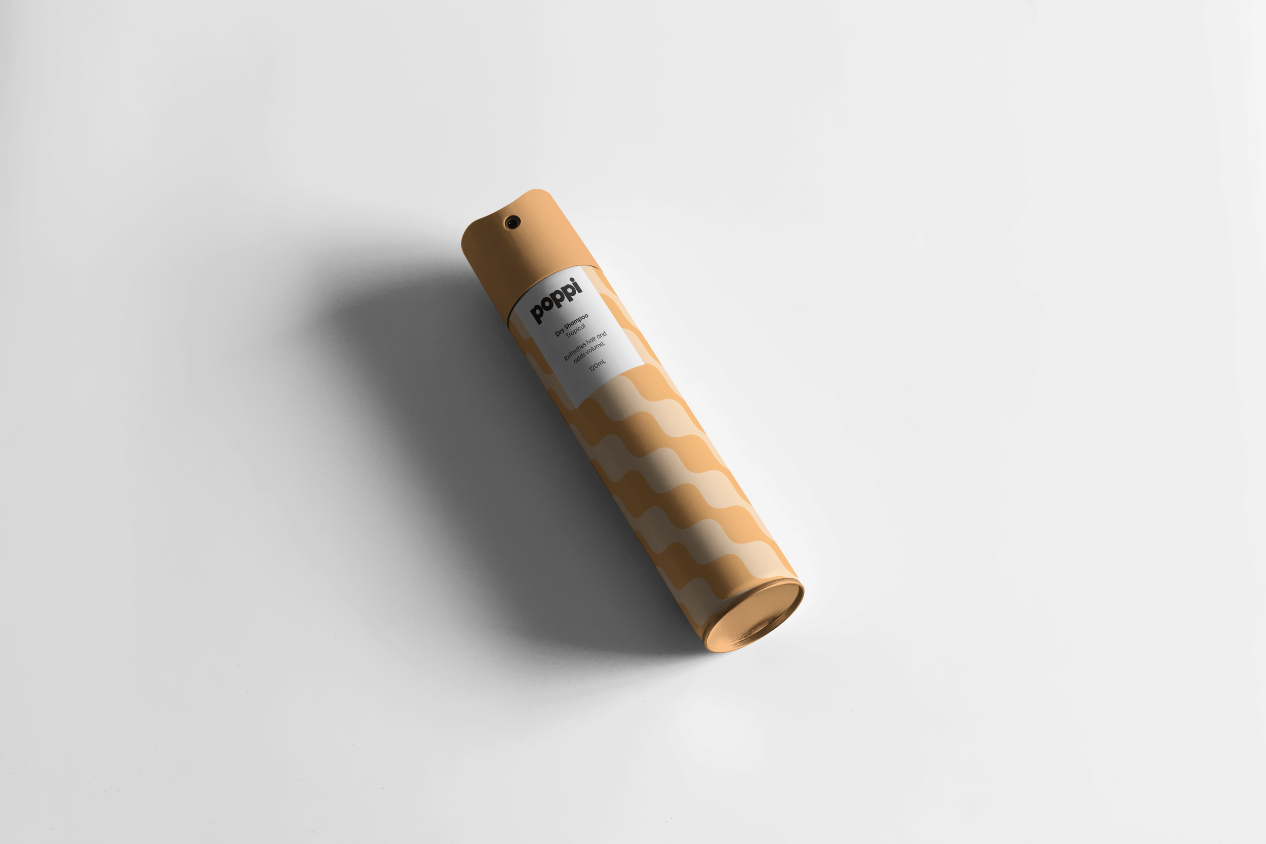
The visual identity was designed to flex across a broad and varied product range. Our guiding principles were to make it lively, desirably disruptive, and portable - easy to apply across multiple formats. Knowing we wouldn’t be designing every product ourselves, we created a foolproof system built around pattern and colour. Each of our core colours comes in three shades, allowing for consistent tonal palettes. Patterns were developed as scalable swatch fills, ensuring uniformity across all packaging.
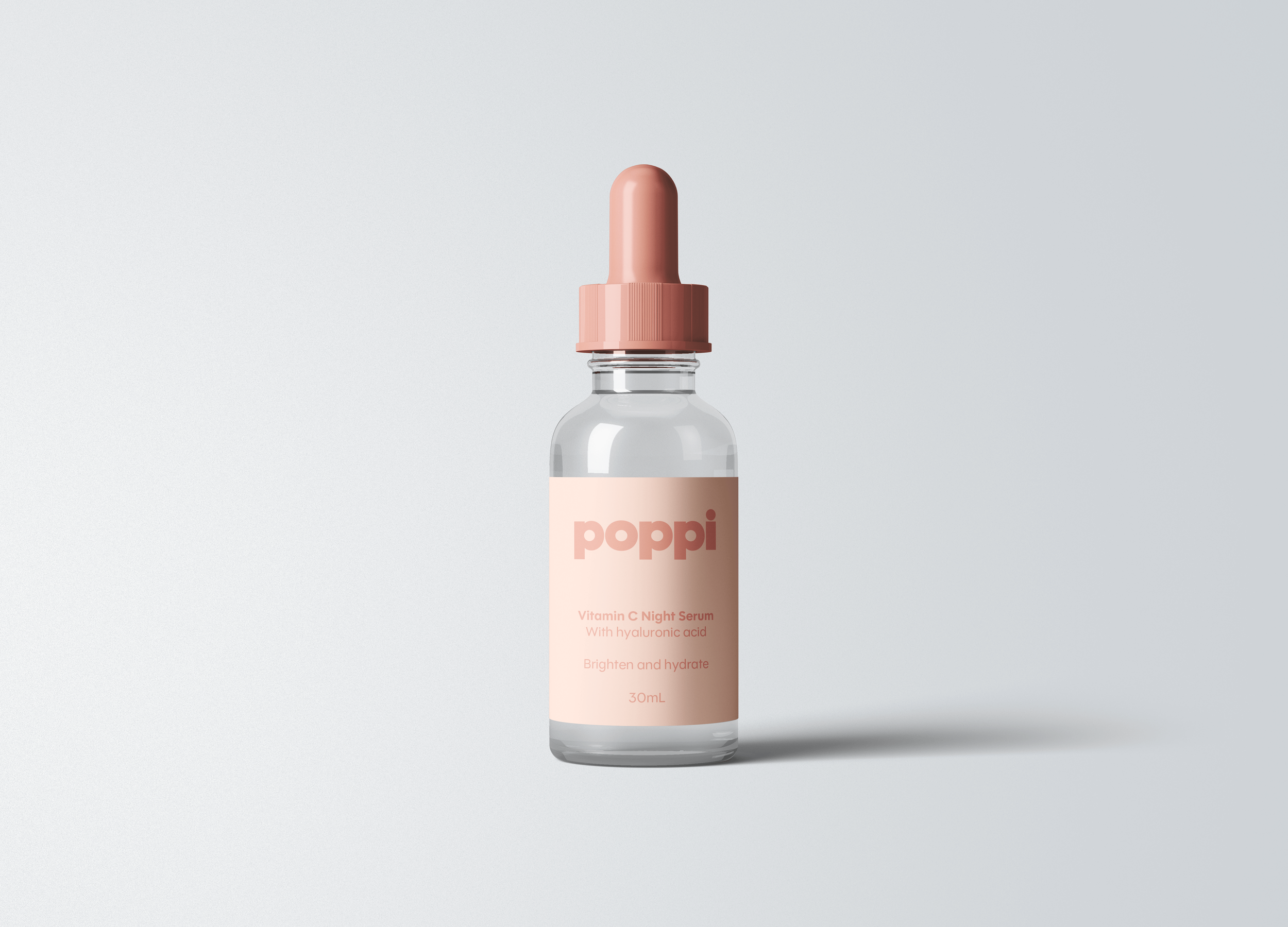
For more refined products - like serums or makeup - the identity can be pared back, offering a simpler, more minimal expression of the brand while remaining distinctly Poppi.
As a feel-good brand rooted in fun and positivity, we also created a set of hidden ‘mantras’ - quiet words of encouragement from Poppi, tucked inside the packaging like secret whispers of support.
Design: Special Design
Client: The Warehouse Group
Naming
Brand Strategy