East Imperial
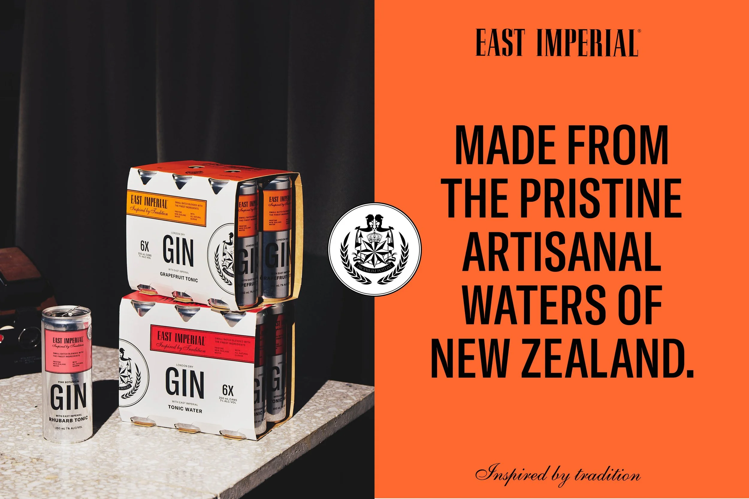
East Imperial is renowned for its refined tonic waters - crafted from a 1903 recipe, using all-natural, Asian-sourced ingredients and pristine New Zealand spring water. With a legacy steeped in tradition, the brand was poised to enter new territory: a premium canned G&T designed for a more casual, younger (yet still discerning) audience.
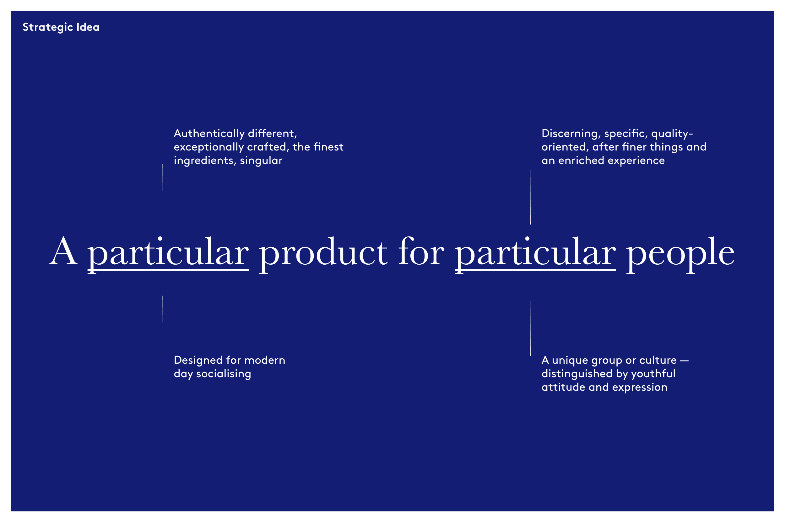
Partnering with Special Design and client Brix & Co., I helped lead the brand strategy, shaping how East Imperial could evolve to meet the expectations of a quality-conscious new generation while honouring its craft roots. Our strategic foundation centred on the idea: “A Particular Product for Particular People.”
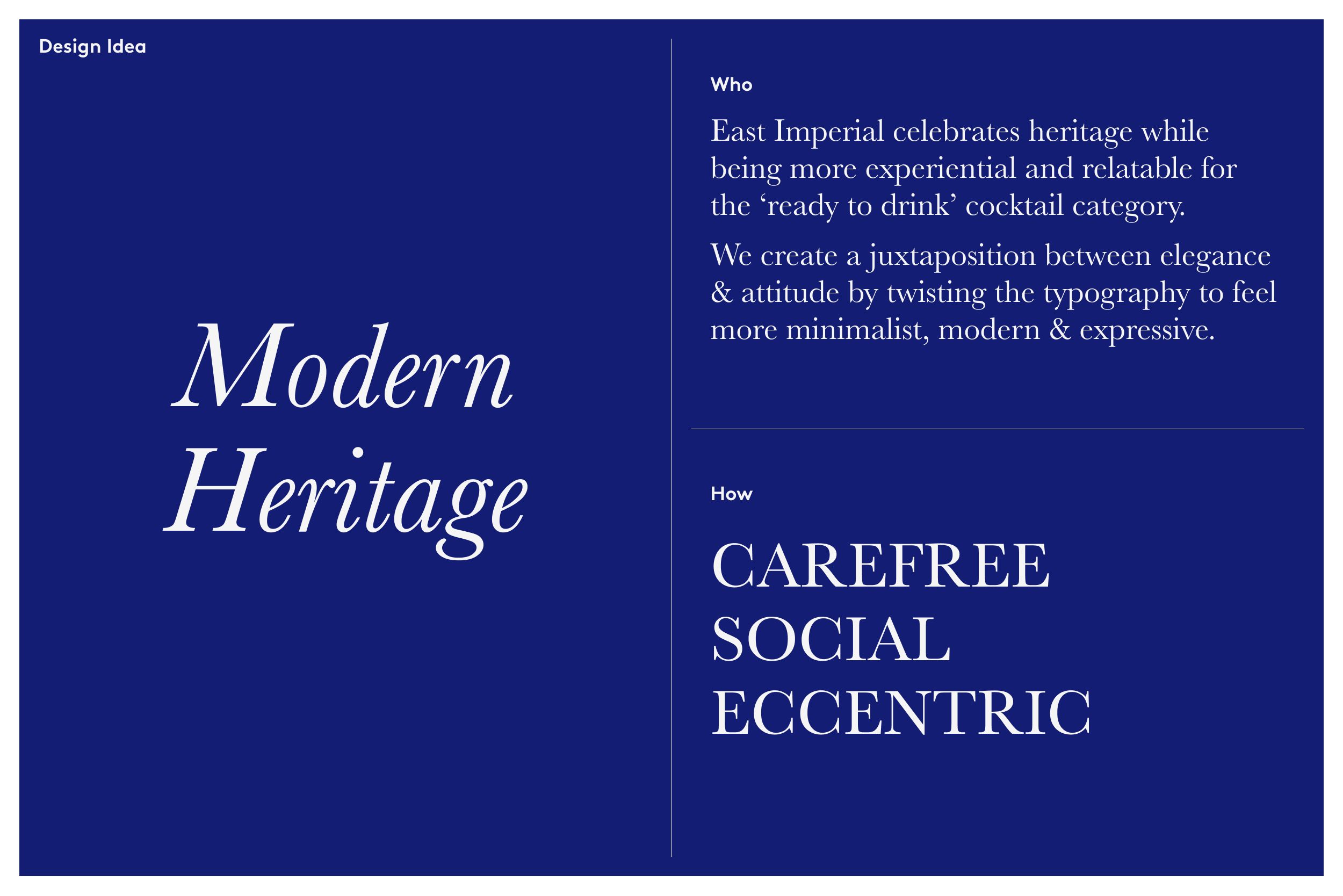
We explored a range of design territories before landing on a bold direction that bridges heritage and modernity, building on the brand’s established attributes.
The result is a confident, nude-toned can that signals purity and sophistication, free from artificial flavours or preservatives. Elevated by refined labelling and print techniques, the design breathes new life into a trusted name, offering a fresh take for today’s G&T drinker.
Design: Special Design
Client: Brix & Co.
Brand Strategy